


DATA

ABOUT
 CHECK IT OUT LIVE
See it on GitHub
TOOLS
Data Processing
- Python - Core Language
- Pandas and Numpy - Data Manipulation
- Google Colab - Data Exploration and Development
Visuals
- MatPlotLib and Plotly - Graph and Plot Creation
- Streamlit - Dashboard Platform
- CSS - Styling
PROCESS
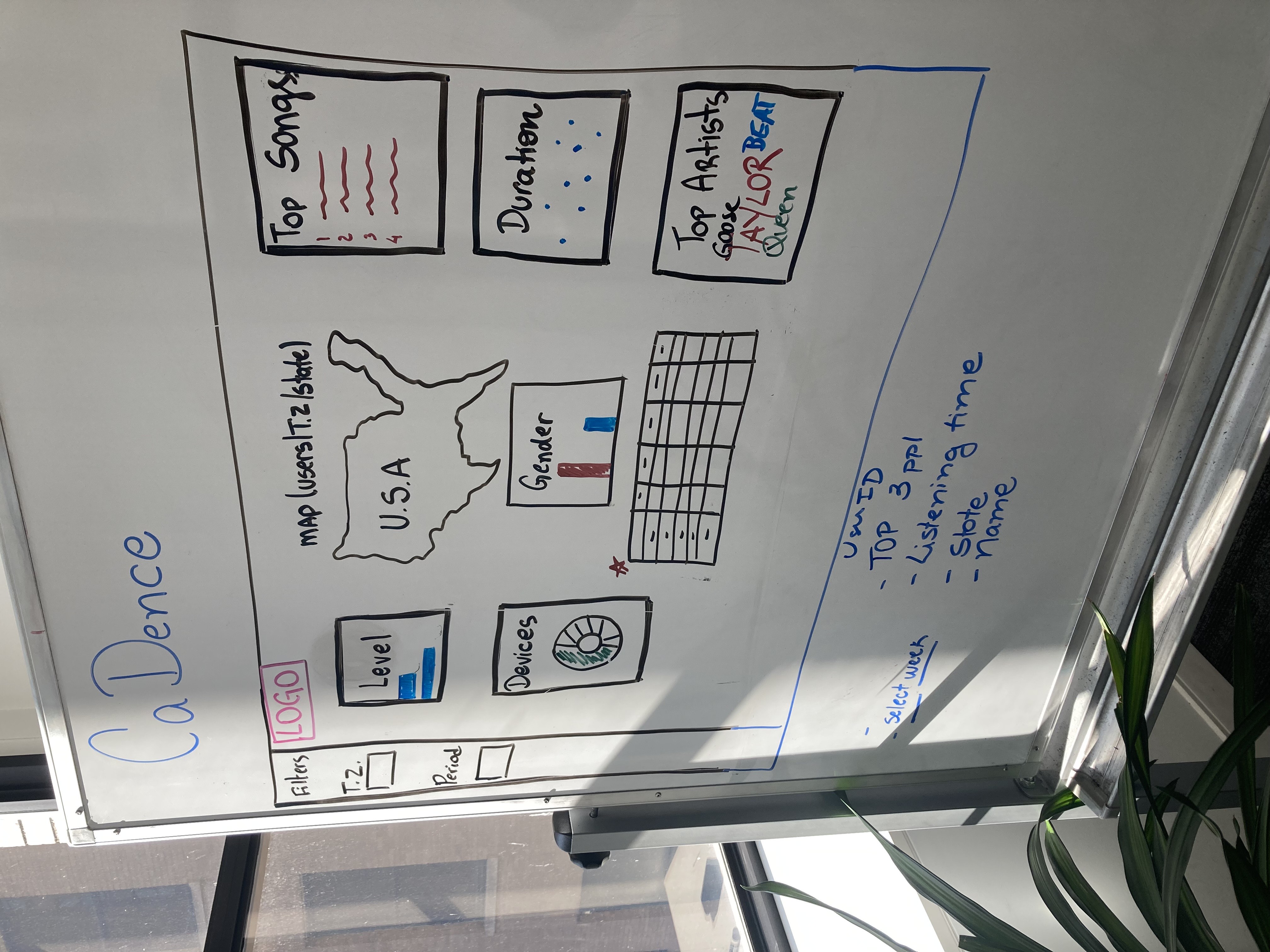 The field of Data Science is vast, and it was incredibly hard to choose our tools and approach.
We only had two weeks to deliver the finished product, so we went with tools with lower learning curves to ensure we produced a robust, responsive product.
The field of Data Science is vast, and it was incredibly hard to choose our tools and approach.
We only had two weeks to deliver the finished product, so we went with tools with lower learning curves to ensure we produced a robust, responsive product.
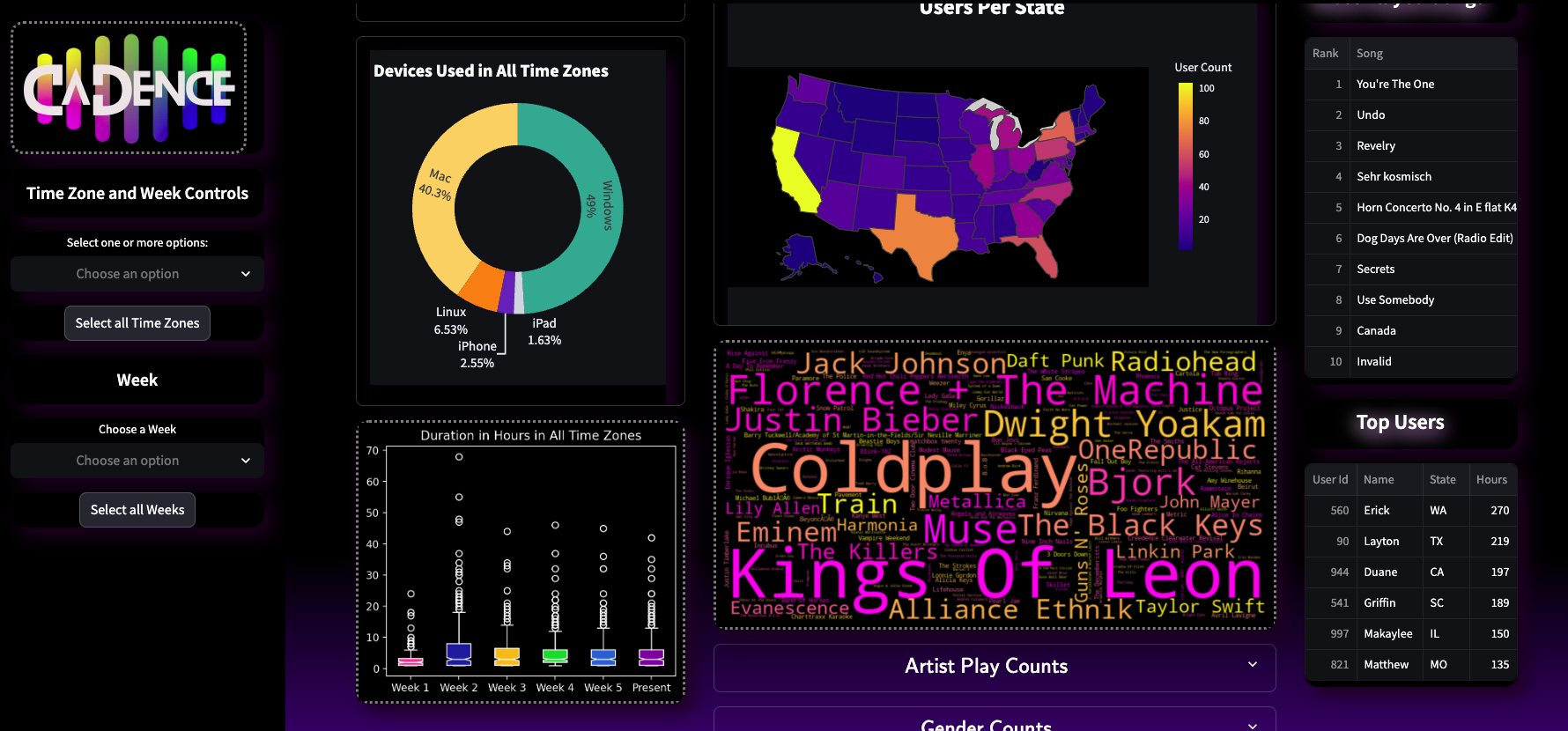
My teammates created the fictional data through the use of an EventSim that resulted in a 19 column, 160,000+ line json. I completed some manual data cleaning due to the use of quotation marks in song and artist names.
Next, we discussed what correlations we wanted to do and decided what columns we should keep, which we should drop, and which we should add.
We decided that a marketing team would find regional data most useful and wanted to simulate a data collection over a six week campagin.
This meant that we had to add time zones via states and used a throw-away column 'ts' to be the key and value for the simulated weeks.
With Pandas, we added time zones and weeks, and narrowed our data to just 13 columns.
In Google Colab, we divided the correlations up between us and developed the logic and graphs needed.
I worked on the filtering logic that fed the aggreation functions, allowing the user to create a dataframe by filtering by both timezones and weeks. I also produced the formated print at the top of the dashboard that states unique users and duration. I produced the duration graph and the Top Users board.
Working together, we researched Streamlit for the dashboard framework due to the ease of deployment and implementation. Once the dashboard was in development, I began work on the styling. This meant altering the MatPlotLib and Plotly graphs as well as writing CSS.
After a great deal of testing, we finished on time with a product that I am proud of to this day.
If you would like to see the Google Colab notebook, you can see it here. It is messy since it was used for testing and exploration. There is a lot of unused code that reflects attempted approaches and code development.
FUTURE PLANS
Database
We had wanted to do this using SQL, Spark, Kafka, and Docker, but we struggled to be able to learn and impliment it within the tight timeframe and still produce something robust.I would love to rework this to use these tools, or tackle them on a different data project.
I am extremely proud of the dashboard as it is.